
Created on 99designs by Vista
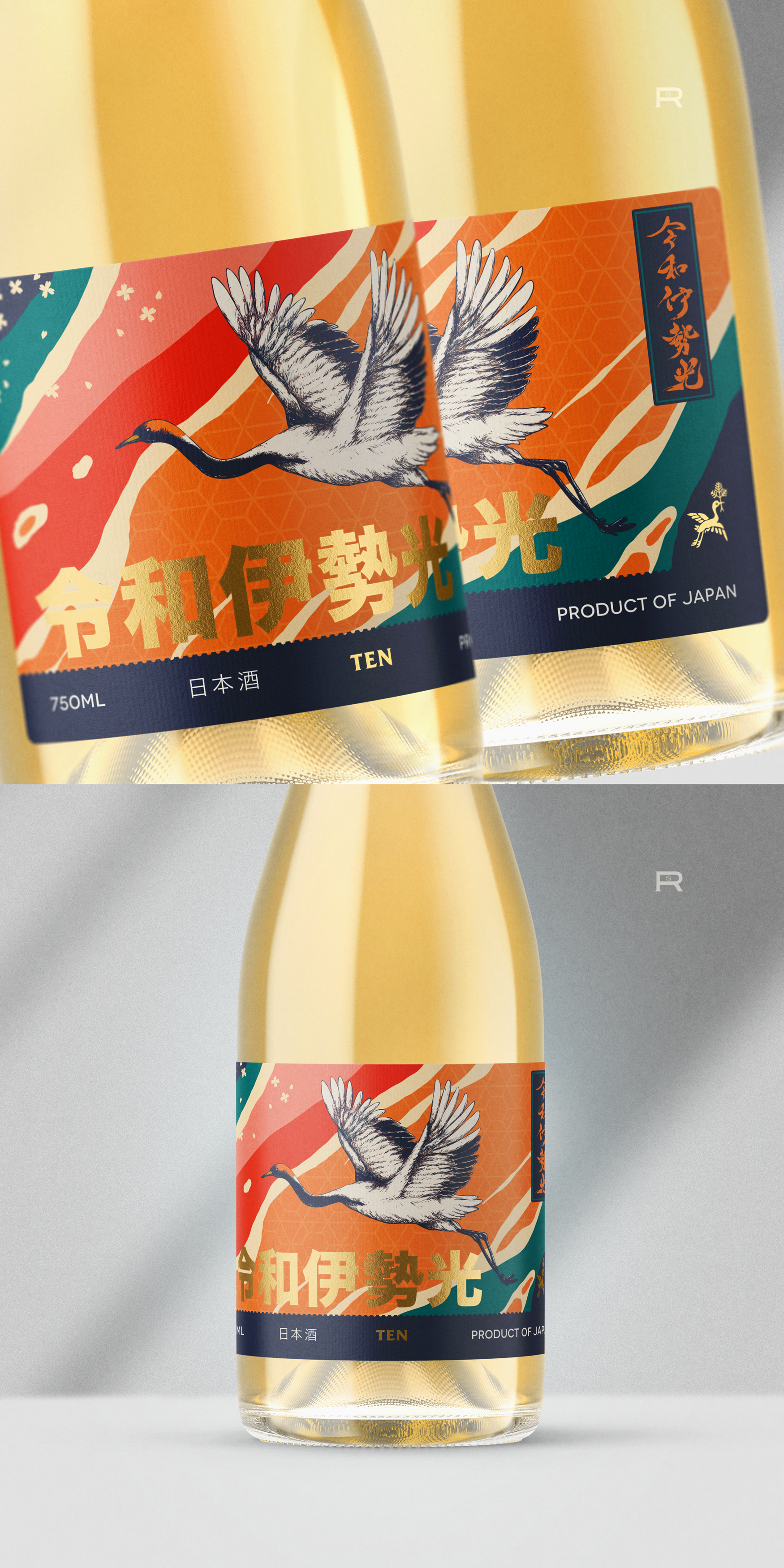
The client required a captivating and bold label for their new brand of premium Nihonshu/Sake. They wanted the label to incorporate references to the crane symbology with energetic vibes. To achieve this, I developed the visuals using organic diagonal shapes that resemble flowing rivers and utilized color combinations commonly found in Asian cultures. Golden foil embellishments were added to highlight the brand name and a small crane symbol. Finally, a horizontal dark blue band was used to ground and contain the product information.