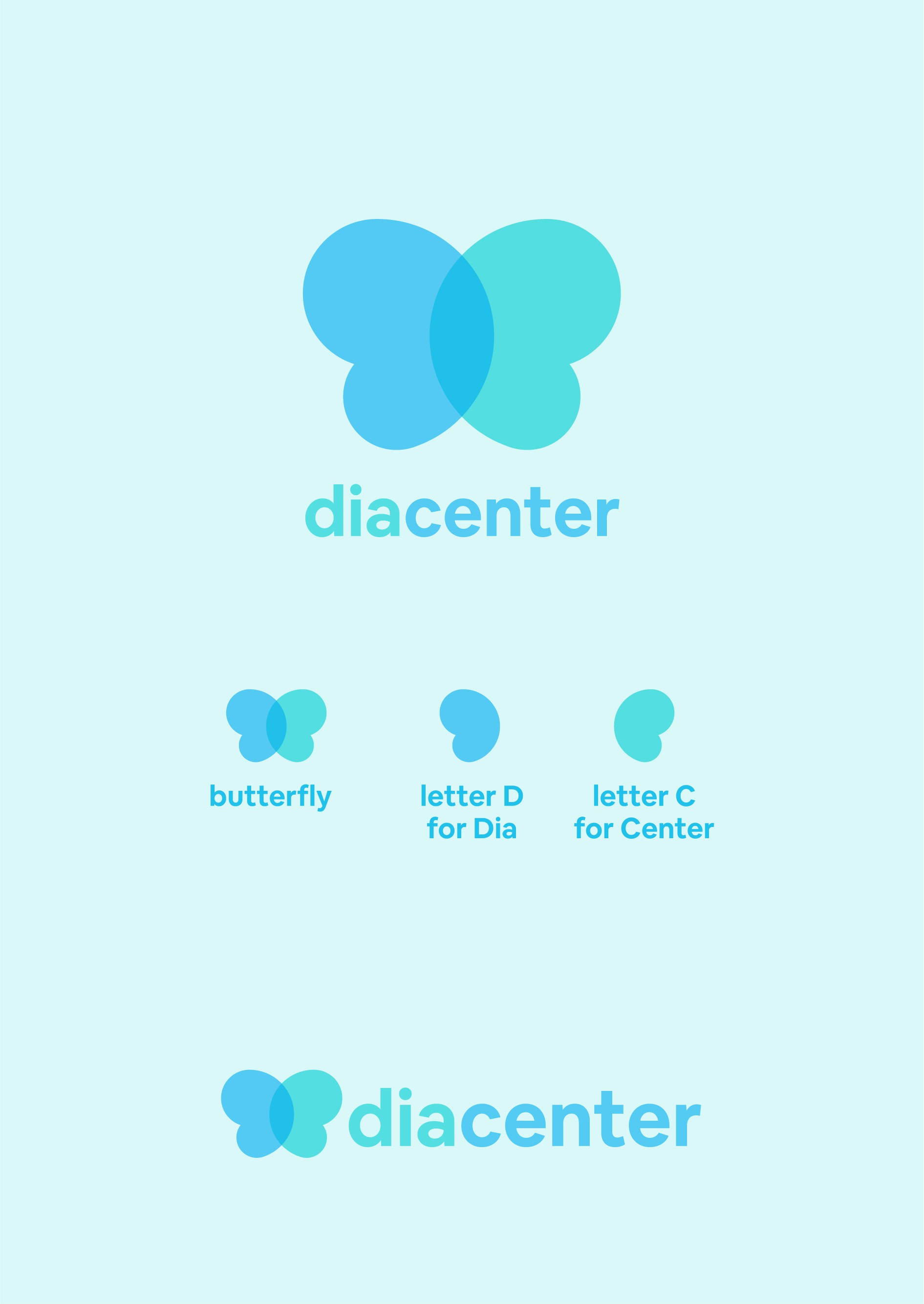

Designing the logo for Diacenter, a treatment center for kidney patients, was a meaningful project. The client wanted a butterfly as the main symbol, representing transformation and hope. I crafted the butterfly using the letters "D" and "C," which are the initials of the company, to create a unique and personal touch.
The design is very simple, yet impactful. I chose soft blue and green colors to convey a calm, medical feel, emphasizing care and healing. These colors are soothing and represent the compassionate and professional nature of the center.
My goal was to make this logo not only visually appealing but also memorable. It's designed to stand out and leave a lasting impression, symbolizing the life-saving treatments and strong relationships built with patients and their families. Whether you're a patient or a loved one, this logo aims to offer a sense of comfort and trust in the care provided by Diacenter.