Aquarium design postcard

0
Created on 99designs by Vista
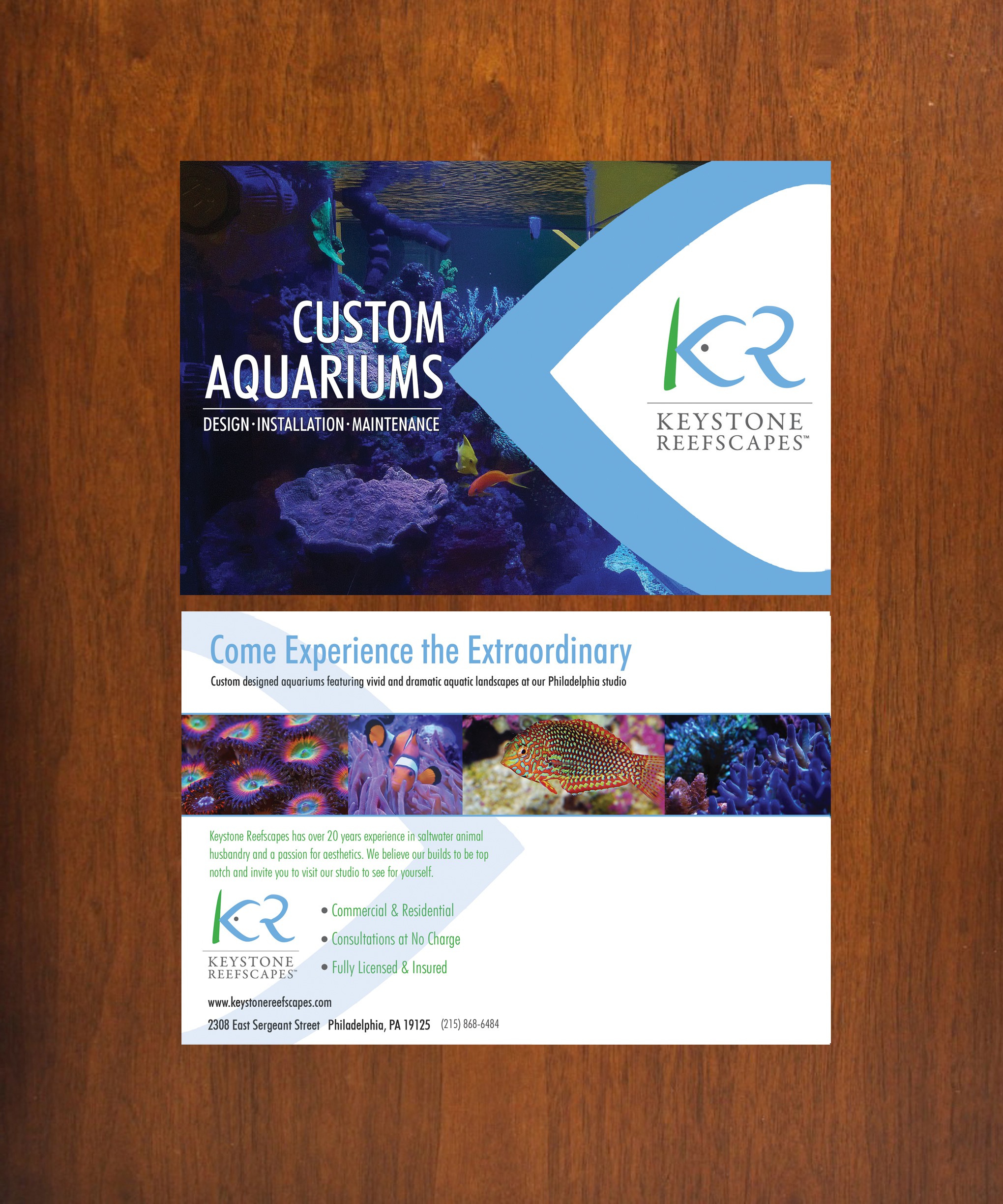
Client designs custom aquariums. Focus is on his logo, surrounded by a lot of white space but inside of an enlarged portion of his logo that resembles a fish. Focusing on this portion emphasizes the beautiful curve and leads our eye to the purpose of the company. Front is clean and clutter free. Back has a call to action and displays more of his work in a simple straight line. Bulleted points make features stand out and utilize the logo again with the "eye" shape and color.