
Created on 99designs by Vista
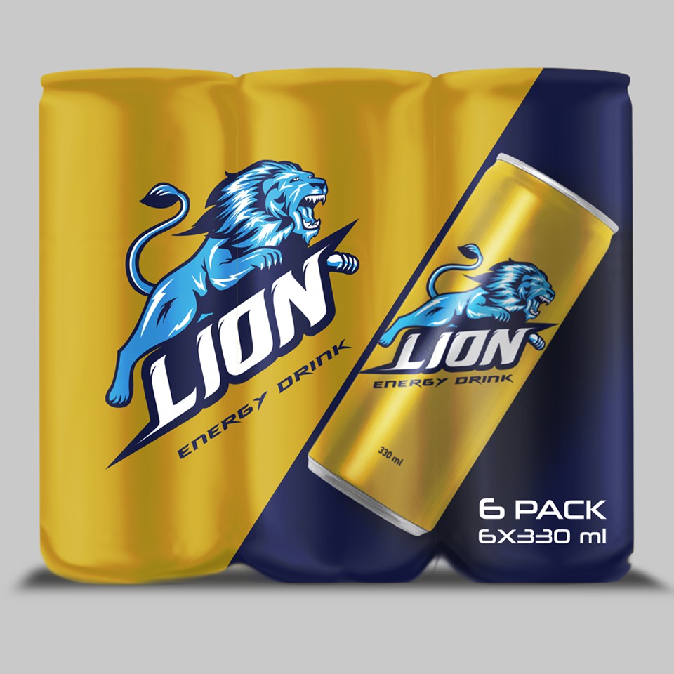
In this project, the brand, packaging and collective packaging of 6 cans were designed, using carefully selected bright colors to make the product stand out from the crowd of competitors. These colors are more inclined to attract the younger generation, the millennials who are passionate about their game, their work, to help them release their accumulated talent.
The Leon is used as a symbol of all the strength and power that the charger brings to the table.