
Created on 99designs by Vista
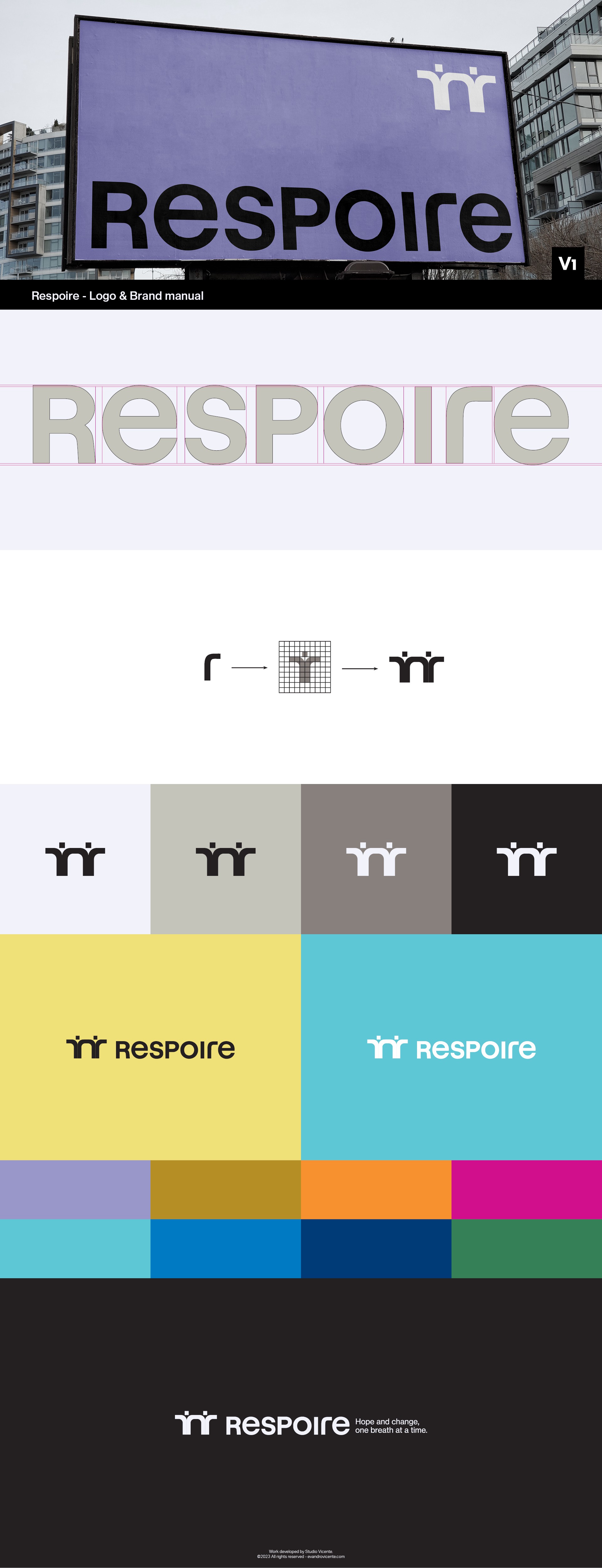
As you can see the design developed is an abstract representation of leaders building other leaders, people who care about people, wrapping a symbol in a sense of unity, community and resilience.
The letter "r" of the logo being transformed into a person and creating a chain / link employed in the brand values.
For it to work in the real world the color palette needs to be more extensive for the brand manual with primary and secondary colors and make the logo remain neutral in its application or advertising.