A modern magazine design

0
Created on 99designs by Vista
The client told us to be free and creative as much as possible and he didn't give us some guidelines and so we decided to created this modern and alternative design.
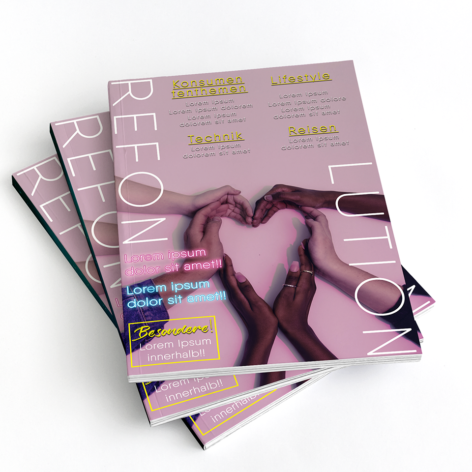
We though to modernize the style of the magazine's name and we designed it in this way - devided. We think that it isn't to hard to read because we used a clear font.
Main topics of the magazine are shown on top of the page. Doing this, the reader will read them immediately. If he is interested he will go ahead in order to know more. In this way we supposed that he will surely read the magazine.
We used bright colors to steer reader's eyes to important titles and objects and clear fonts for a easier reading.