Created on 99designs by Vista
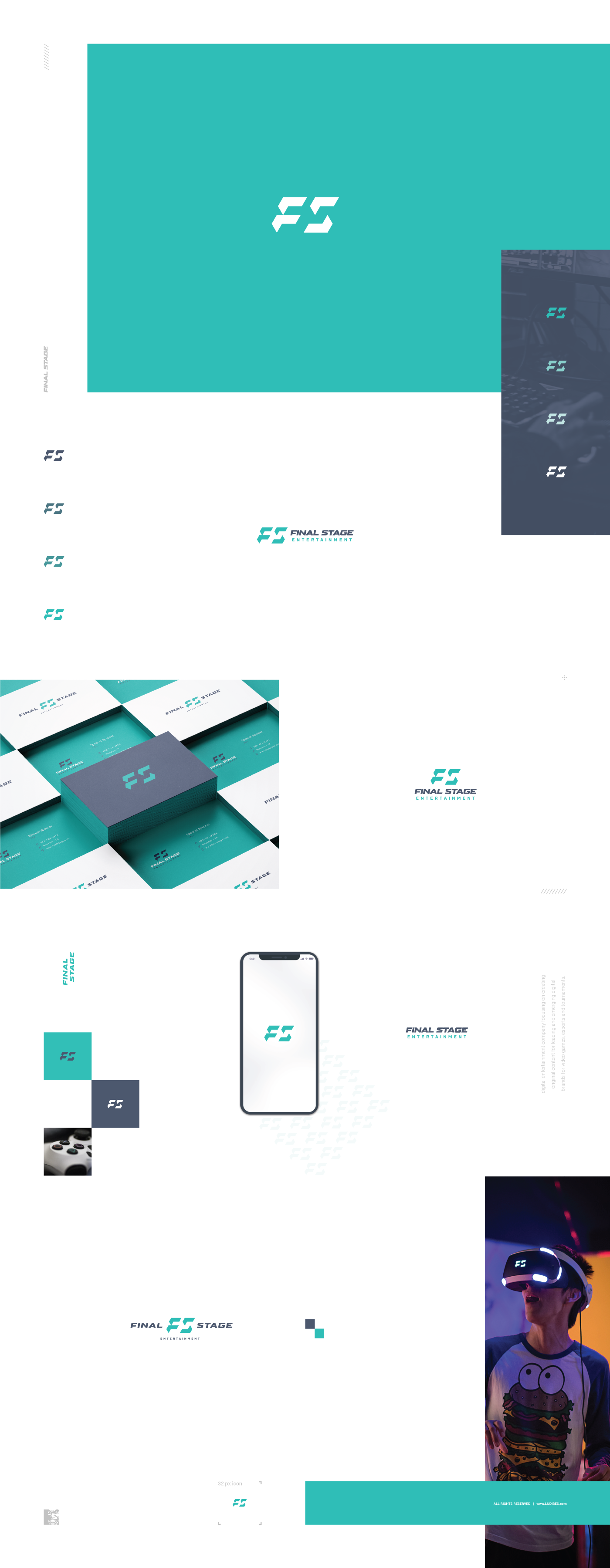
Redesigned logo for digital entertainment company focusing on creating original content for leading and emerging digital brands for video games, esports and tournaments. Assessing the problems they faced with original logo, this rather radical change in design direction and style yielded a great looking modern monogram that fits like a glove into target market and industry. Geometric and sporty, it is bold and made of four equal pieces. In fact, letter S is created by simple rotation of bottom part of letter F, which opens up possibility for neat logo animation. It is paired with bold and wide lettering, comes in several layouts and fresh new colorway.
